Vitro
A Vite-native component workshop for Vue 3
- Stories are real Vue templates
- Controls derived from your props
- A playground non-developers can use
Vitro is a component workshop for Vue 3 — the thing you open to build a component in isolation, before it has a page to live on.
It exists because writing Storybook stories was always the part of the job I put off. Authoring friction was the problem I actually wanted to solve; format churn came a close second, because a story format that keeps changing underneath you turns migrations into routine work. Histoire, the obvious alternative, had stalled.
The CLI is vitro. Vite is the builder — not wrapped, not shimmed, just Vite.
Who it turned out to be for
It has earned its keep in a way I did not plan for. A lot of my work at Spamhaus is building components that the marketing team have only ever seen as a Figma frame — approved in a design file, never touched. Giving non-technical stakeholders somewhere hands-on to poke at instead (change the props yourself, with the Figma frame it came from on the same page as the real rendered component) has been worth more than any amount of written documentation.
That is what makes the shareable-URL state and the figmaUrl embed the two features I would
keep above all the others: they turn "here is the component" from a meeting into a link.
Stories are just Vue
The format is a .story.vue file containing ordinary Vue markup:
<template>
  <Story title="Button">
    <Variant title="Primary">
      <AppButton variant="primary">Save changes</AppButton>
    </Variant>
  </Story>
</template>
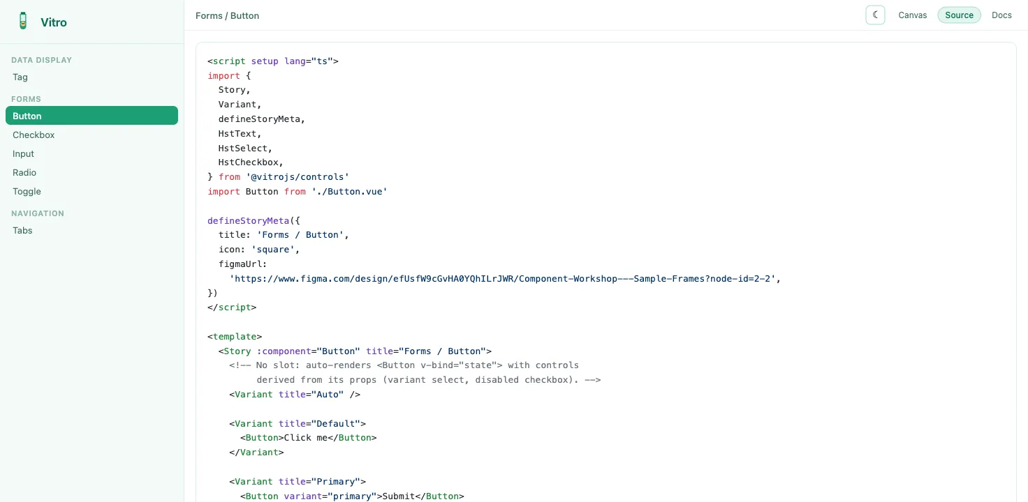
No abstract args object standing in for a template. You write the markup you would actually
write, which means a story is readable by anyone on the team and stays honest about how the
component is really used. The format is a semver-protected, additive-only contract — the
migration churn is the thing I was trying to escape, so committing to never causing it was the
point.
Controls you didn't have to write
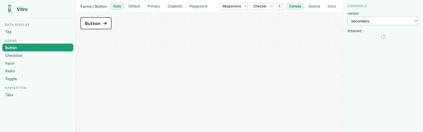
Controls are derived from the component's own props via vue-component-meta. A variant with no
slot content auto-renders <Component v-bind="state" />, so a component you have just written
gets a working playground with zero configuration. Manual Hst* controls are there when you want
to override, and control changes update the preview live without remounting — state survives, so
you can tweak a prop mid-interaction.
Three views
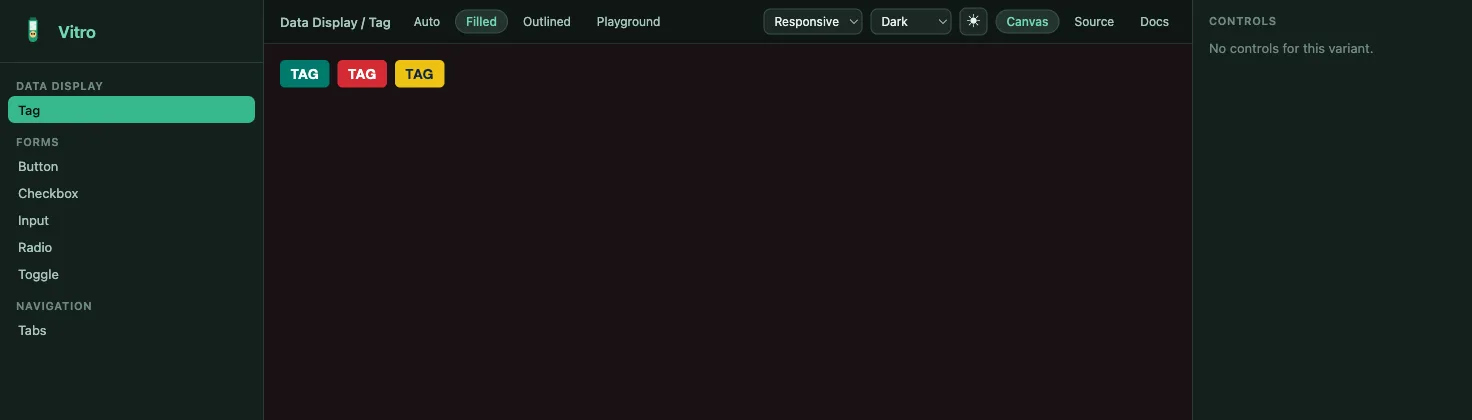
Canvas for the component, Source for Shiki-highlighted markup, Docs for autodocs —
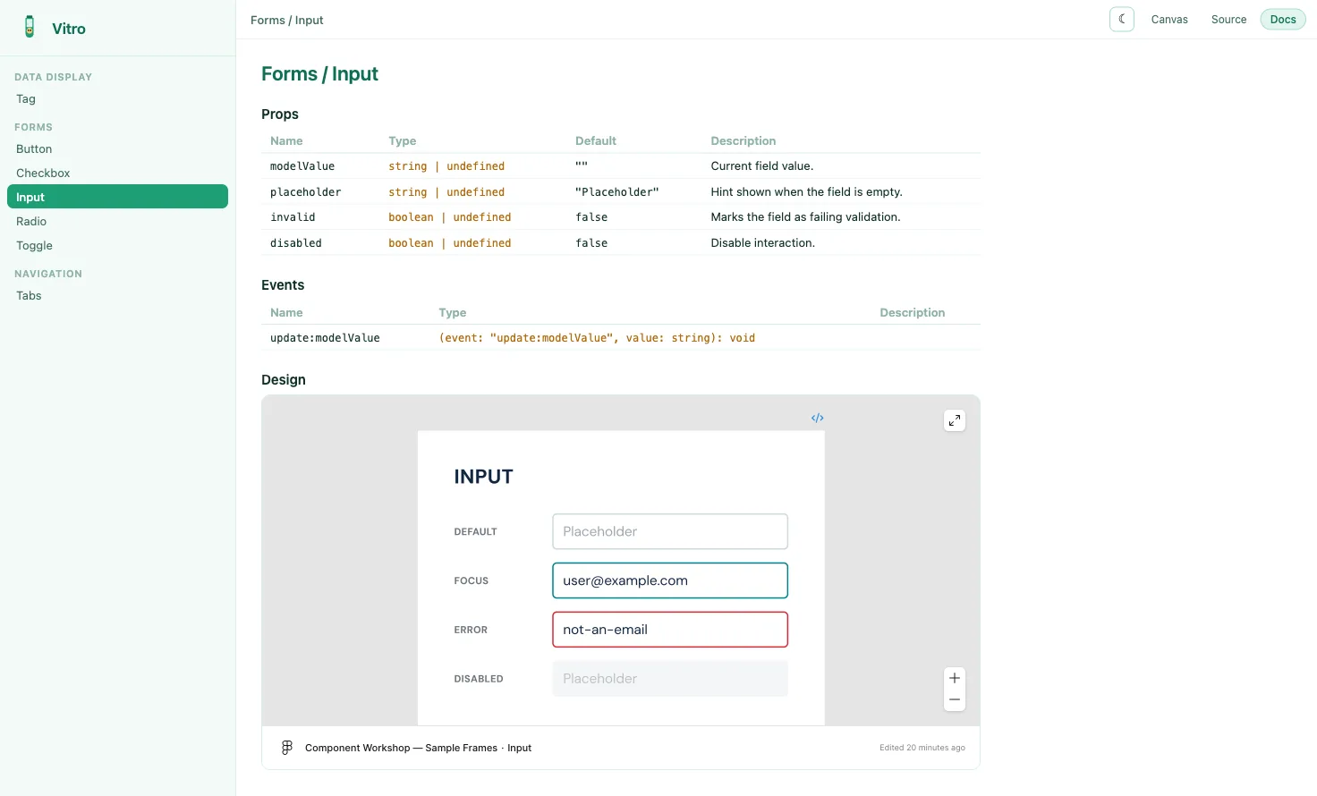
prop, event and slot tables pulled from the type signatures, including JSDoc descriptions. If a
figmaUrl is set on the story, that frame embeds under the tables — and because the URL carries a
node id, each story points at its own frame rather than the whole file.
The full UI state — story, variant, every control value, viewport, background, theme — is encoded in the URL. Any view you are looking at is a link you can paste to a designer.
Built output
vitro build produces a static, relative-path dist/ with per-story chunks that will serve from
any subpath. It also emits a Storybook-compatible /index.json, so existing visual-regression
tooling — Lost Pixel, Playwright — works against it without adaptation. Adopting a new workshop
should not mean rewriting your VR pipeline.
Status
Everything described here works today — the story format, derived controls, all three views, URL state, and the static build. Hosted publishing is the next piece: somewhere to put a built workshop so a designer can open a link without running anything locally.